Main Content

Preparing files for CreateSpace

CreateSpace’s print guidelines are pretty simple.

Make sure there’s nothing within the .75-inch spine margin (if you use hanging punctuation you’ll need a larger margin because they WILL reject the book if there’s even a portion of an em dash there; the .75-inch margin is for books of 151-400 pages) and within .25 inch on the other three sides if you’re printing in B&W. “Nothing” means no background images, not just text.

For the cover, use a .125-inch bleed. For B&W books, calculate the spine width:
• White paper: multiply page count by 0.002252
• Cream paper: multiply page count by 0.0025

Allow .0625 inch of space on both sides of the spine text.

Using InDesign, export the text as PDF/X-1a; for color use PDF/X-3. Your InDesign file can use RGB.

If they supply the bar code, it will go on the lower right back cover, .25 inch in from spine and bottom.

CreateSpace provides a PDF with guidelines:
https://www.createspace.com/ServicesWorkflow/ResourceDownload.do?id=1583

Ordering ARCs

An ARC (advance reading copy*) is a prepublication copy of your book that is distributed to reviewers and bookstores to stir up interest in your book. If reviewers provide feedback in time, excerpts of their reviews can be used on the cover and in marketing materials. Bookstores may place orders for your books based on the ARC.

Traditionally an ARC had a plain white cover. Now it’s more likely to be full color with some type of notice on the front:

ADVANCE READING COPY
Uncorrected proof
Not for sale

The back cover may contain the book description. More importantly, it will give the release date, all the formats to be available, ISBN, category, price, marketing and publicity contact information, distribution information, and bullet points of the marketing plan (important for booksellers). The back cover will not have a barcode.

Printers who specialize in printing using a digital press (as opposed to offset) will print as few as 25 copies.

360 Digital does good work, and their prices are competitive.
360digitalbooks.com

Many of the established book printers are adding digital capabilities, if they don’t already have them. It doesn’t cost anything to get a quote. Make sure the printer you request a quote from offers digital printing. Offset printing usually isn’t cost-effective until you’re printing 500 or more books.

Here are some of the book printers used by my clients that provide both offset and digital printing:
McNaughton & Gunn
Color House Graphics
Bang Printing
Thomson-Shore

*Advance, not advanced; reading, not review.

The ellipsis in books (print and ebook)

Before the ellipsis character arrived with the creation of computer fonts, typesetters used spaced periods (also known as spaced points or ellipsis points). In traditional book design, spaced periods are still preferred. The ellipsis character is generally too narrow and abrupt for its intended purpose: to show where text has been omitted or to replicate the trailing off of speech or thought.

Occasionally — almost always in nonfiction — four ellipsis points are used. Four points are needed only for omitted material that ends in a complete sentence.

Original: The two girls with the water guns ran through the alley, shooting as they went. The dogs chased after them.

Condensed: The two girls . . . ran through the alley. . . . The dogs chased after them.

Nonbreaking spaces should be used between the periods to prevent the ellipsis from being split across lines. In print, spaces of varying widths are available. There should be no space between the ellipsis and a closing or opening quotation mark.

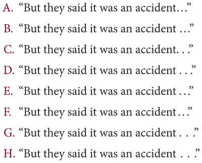
Ellipsis points typeset seven different ways

A. Ellipsis character, no space before
B. Ellipsis character, space before
C. Standard spaces, no space before
D. Standard spaces, space before
E. Thin spaces, standard space before
F. Thin spaces, thin space before
G. One-third spaces, standard space before
H. One-third spaces, one-third space before
Set in Minion Pro

For this example, I prefer F, then D. Sentence A is acceptable, but I would add a hair space, which isn’t shown in any of the sentences, before the ellipsis character. Note that the ellipsis character for this font might be wider than the ellipsis character for other fonts.

Sentences B, C, and E are utterly uncouth. Don’t close up spaced periods to the previous character or leave a wide space before a tight ellipsis.