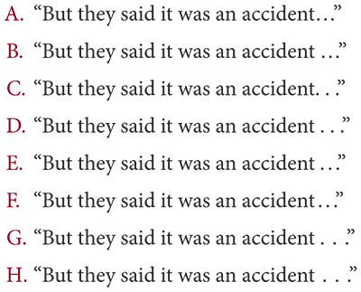
Before the ellipsis character arrived with the creation of computer fonts, typesetters used spaced periods (also known as spaced points or ellipsis points). In traditional book design, spaced periods are still preferred. The ellipsis character is generally too narrow and abrupt for its intended purpose: to show where text has been omitted or to replicate the trailing off of speech or thought.
Occasionally — almost always in nonfiction — four ellipsis points are used. Four points are needed only for omitted material that ends in a complete sentence.
Original: The two girls with the water guns ran through the alley, shooting as they went. The dogs chased after them.
Condensed: The two girls . . . ran through the alley. . . . The dogs chased after them.
Nonbreaking spaces should be used between the periods to prevent the ellipsis from being split across lines. In print, spaces of varying widths are available. There should be no space between the ellipsis and a closing or opening quotation mark.

A. Ellipsis character, no space before
B. Ellipsis character, space before
C. Standard spaces, no space before
D. Standard spaces, space before
E. Thin spaces, standard space before
F. Thin spaces, thin space before
G. One-third spaces, standard space before
H. One-third spaces, one-third space before
Set in Minion Pro
For this example, I prefer F, then D. Sentence A is acceptable, but I would add a hair space, which isn’t shown in any of the sentences, before the ellipsis character. Note that the ellipsis character for this font might be wider than the ellipsis character for other fonts.
Sentences B, C, and E are utterly uncouth. Don’t close up spaced periods to the previous character or leave a wide space before a tight ellipsis.